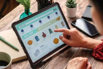
Blog post updated: February 13, 2019
What is responsive design and why is it important?
To get back to basics, responsive design renders websites to specific device sizes. It delivers a different design experience for mobile, tablet, and desktop users, but many companies wonder if this approach is enough to deliver an optimal experience to users across devices.

There’s no question that there needs to be continuity of experience for consumers when jumping from a desktop or laptop to a mobile device or tablet. With about 52% of all website traffic coming from mobile phones in 2018 (up from 16% from just 5 years ago ), it’s more critical than ever that websites can offer up sequential experiences that will render optimally on every device. By allowing a website to adapt its layout to device-specific requirements, RWD has been touted as a way to make this happen.
Which is Not True about Responsive Sites?
But amidst the hype, there are some realities. And during our webinar “The Truth About Responsive Design,” Linda Bustos, director of ecommerce research at Elastic Path Software, and Rob Yoegel, content marketing director at Monetate, delved into the truths and the falsities about RWD. Read on to find out how they debunked some of the more widespread myths:
FALSE: Customers want the same website experience, regardless of the device they’re on
“It’s not one-size-fits-all when it comes to the multi-device customer experience, said Yoegel. And the expectations about that experience will depend on circumstances. Rather, marketers need to think about content and what the customer wants on the specific device they’re on. The example Yoegel gave was the store locator.
Say you’re a consumer that goes to a website to find the store closest to where you are. That experience likely needs to be different depending on whether you’re on mobile, a tablet, or a desktop computer.
“We’ve found that when many of our customers do consumer surveys, many of those consumers on smartphones just want to be able to find a store. Sure, they’d like to shop, they’d like to find the latest sale, and do other things that they do on desktops,” Yoegel said, but it’s really about making the locator easily accessible on the homepage of the mobile experience. Conversely, on a desktop, the store locator is probably buried to some degree, but most likely that’s not the content that the desktop user is interested in.
FALSE: Responsive design makes your website faster
“Word of caution,” said Yoegel about the common misperception that if you use RWD, it means that everything’s that’s happening in the browser’s going to happen super fast. “When you’re doing responsive design, don’t just assume that your website download speeds or load efficiency is going to improve.”
The reality is, sometimes it doesn’t. If you think about responsive design being one website for all devices, that means all of the content and images and files that make up a webpage have to be called from the server back to the browser, and then displayed accordingly based on the responsive design. You may end up resizing an image, you may end up not showing an image or end up moving something like a store locator higher on the page.
FALSE: Responsive design is “future proof”
“To say that responsive design is going to solve all your problems from here ‘til eternity is unrealistic,” said Bustos. “While responsive design is certainly a great way to scale your website efficiently and use a single code base, we don’t know what the future has in store.”
Responsive web design is something you do to satisfy web browsers, so right now, the thought process is, should you build a website or should you build an app? But if you throw HTML5 in there, you can have a website that acts very much like an app, which can create a much better user experience.
“Browsers may become obsolete because there’s going to be more and more innovation,” said Bustos. Earlier this year, Forrester released a report announcing the continuing importance of mobile devices and how they believe these devices will no longer be siloed & app driven. Businesses will need to plan for an entire ecosystem of connected devices, reaching consumers across various touchpoints. With the Internet of Things, email, and voice, your website is only one access point for consumers, which needs to carry a consistent feel and brand across various platforms. These other touchpoints should not be designed for a computer, but need to be designed for ease of use for each platform. Mobile experiences need to be designed for mobile and desktop experiences need to be designed for desktop users. This means UX designers, marketers, and copywriters need to consider how each device is used and what experience users expect from that device.
TRUE: A Good Website is a Useful Website
Just remember that a usable website doesn’t necessarily mean its a useful website. As Yoegel said, “Don’t get caught up in the next shiny object. It’s not just about the beauty, it’s about being useful. What are your customers expecting from you in a mobile device? What experience do they expect to have with your brand? Always remember that you have to consider context, behavior, what they’re doing and what they need from you now.”